From visual identity to campaign: building a brand people recognise
Strategy before the logo, the components of an identity that holds, the full video production process, and the method for producing and testing AI-assisted ad creative without losing your art direction.
You recognise a brand before you read it. That recognition does not come from a successful logo but from a coherent whole, repeated long enough to sink in: colours, a typeface, a tone, a way of framing images. This article covers the three stages of that work — building the identity, setting it in motion on video, then rolling it out into campaigns without diluting it.
Strategy before the visual
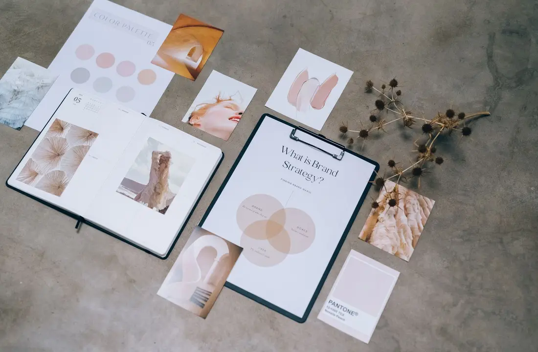
A successful visual identity does nothing more than make a brand strategy visible. Four questions therefore have to be answered in writing before the first sketch: why you exist, what guides you, what personality your brand would have if it were a person, and exactly who it speaks to.
Without those answers, design can only decorate, and the discussion about the logo becomes a matter of taste — the founder's, the designer's, the founder's spouse's. With them, every proposal is judged against a verifiable criterion: does this express what we wrote down?
The components of an identity that holds
Five elements, not one more to begin with.
The logo and its variants — primary version, monogram, black-and-white version — because a logo that exists in only one version gets distorted by the first application that does not suit it. The colour palette: one or two primary colours, a few neutrals, an accent colour, with their exact codes. The typography: one typeface for headings, one for body text, legible everywhere, including on a phone screen in bright sunlight. The visual style: the kind of photography, illustration and icons, the way images are framed and cropped. And the tone, meaning the brand's voice, which has to match the visuals — an understated identity and an exuberant tone produce an unease nobody can quite name.
What colours say
| Colour | What it often suggests |
|---|---|
| Blue | Trust, seriousness |
| Black | Elegance, premium positioning |
| Purple, indigo | Innovation, creativity |
| Green | Nature, growth |
| Red | Energy, urgency |
These associations are cultural and approximate, but they act before any conscious thought. The deciding criterion is the emotion you are aiming for, not personal preference — and the second criterion, often forgotten, is what your competitors do: in a sector that is entirely blue, blue makes you invisible however well chosen it is.
The guidelines: the brand's instruction manual
Brand guidelines guarantee consistency when you are not in the room. They define how the logo may and may not be used, the precise colour codes, the sizes, the clear space around it, and give examples of what to do and what not to do.
Without them, every piece of material drifts a little, and the sum of those gaps dilutes the brand within a year. With them, an outside supplier produces a compliant document without having to call you.
The full process comes down to six steps: clarify the strategy, gather references in a mood board, design the logo and its variants, settle the colours and typefaces, produce the first concrete applications — business card, website, social profiles, email signature — then document the lot. The fifth step is the one most often skipped, and it is the one that reveals the problems: a logo that works on a slide but not on a business card is not finished.
Setting the brand in motion
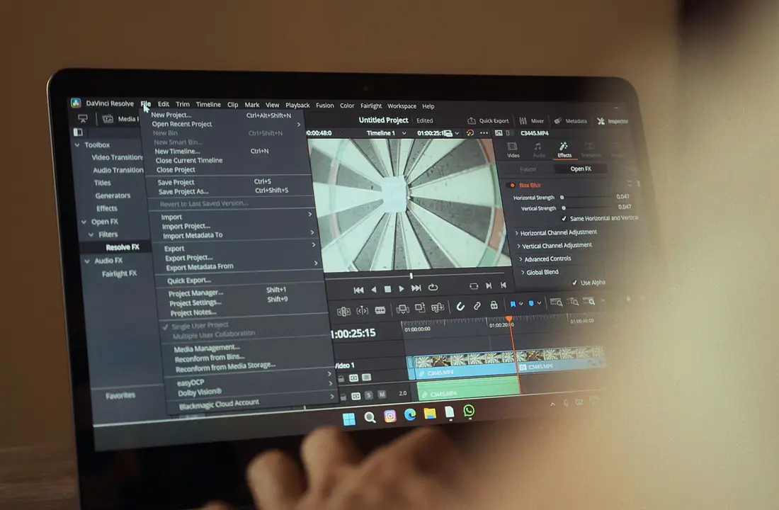
A video that leaves a mark is not improvised, it follows a process. Whether it is a brand film, an advert or a short clip, the essentials are decided before the camera is switched on.
Preparation carries most of the result. A concept that fits in a single sentence, a mood board that fixes the references and the colours, a shot-by-shot breakdown, and settled logistics — locations, dates, equipment, crew, permits. A written breakdown avoids hours lost on the day of the shoot and costs that appear nowhere in the original quote.
The shoot rewards rigour more than talent. Image quality comes first from the lighting, not from the camera. Bad sound ruins a beautiful image, which makes dedicated microphones non-negotiable. Film more than you need — details, atmospheres, cutaways — because it is in the edit that you discover what is missing. And watch the continuity, the costumes and the props from one shot to the next: an inconsistency is noticed even when people cannot name it.
The edit gives the piece its rhythm and its emotion, in four stages: select the best takes, assemble the narrative, cut to the music or to the argument, then dress it — titles, animations, transitions.
The finishing is what visibly separates the amateur from the professional: the colour grade, which should serve your visual identity rather than a fashionable look, the mix between music, voice and atmospheres, and the detailed sound work that brings the image to life.
Distribution, finally, is planned from the breakdown stage onwards. A single shoot should produce a long format for the website and the platforms, vertical formats for social media, and short extracts for advertising. Deciding after the fact costs you an approximate crop; deciding beforehand costs you two extra shots.
For a first brand film, the minimum version fits in five lines: a single message, three to five key shots, good light and good sound, a short edit — the first three seconds decide the rest — and a vertical version.
Rolling it out into campaigns, with AI

What used to take days and a substantial budget is now produced in a few hours. AI changes four things in advertising production: speed, with dozens of variants in an afternoon; cost, since there is no longer any need to shoot for every version; testing capacity, which at last makes it possible to search for the winning creatives instead of guessing them; and personalisation by audience.
It generates static visuals — products, lifestyle shots, variants — short videos in vertical format, sets of headlines and hooks, and voice-overs of a quality that is now convincing.
There is a single trap and it is easy to spot: the generic, bland creative that everyone immediately identifies as automated. The defence fits in one sentence — AI executes, you direct. In practice that means the art direction set out in your guidelines applies to everything the machine produces, and that whatever does not comply is thrown away.
The campaign method comes down to five steps. Clarify the offer: a clear promise is the basis of good advertising, and no amount of image generation makes up for a vague offer. Define the angle, in other words the benefit you put forward — saving time, saving money, feeling reassured, standing out — bearing in mind that each angle produces its own series. Generate the variants, three to five visuals and two or three hooks per angle, which quickly produces around fifteen creatives. Test small, with a modest budget, measuring cost per result rather than reactions. Iterate on the winners by building on the ones that already work, rather than starting again from scratch.
Three indicators are enough to steer by: the click-through rate, which tells you whether the creative attracts; the cost per enquiry or per sale, which tells you whether it converts; and the return on ad spend, which settles the matter. Mentions and shares pay nothing.
That leaves the legal framework, which is not optional: image rights and copyright apply to generated content as they do to any other, misleading promises remain misleading promises, and generative origin has to be disclosed wherever regulation requires it.
Consistency across every channel
A brand becomes recognisable through repetition, and repetition only works if it is faithful. Your identity has to hold on the website, on social media, in emails, on sales documents, in videos and right down to the email signature — that is the ‘I recognise this brand’ effect, before the name has even been read.
Dilution almost never comes from a decision, but from an accumulation of small deviations: a presentation put together in a rush with the software's default colours, a post scheduled by a supplier who does not have the guidelines, a sales document reused from an old template. None of these deviations is noticeable on its own; together they blur the brand within a year.
Two habits are enough to guard against it. Put together a single folder, accessible to everyone who produces anything in your name, containing the logo in all its variants, the colour codes, the fonts and two or three ready-to-use templates. And run a quarterly review: lay the last ten pieces produced side by side, across all channels, and look at whether they seem to belong to the same company. The answer is instructive, and the correction takes an hour when the drift is recent.
The common thread
These three pieces of work are really one. The identity sets the rules, the video sets them in motion, the campaign repeats them at scale. A brand becomes recognisable when all three levels say the same thing — and dilutes as soon as one of the three is handed to someone who has not read the guidelines.
Going further
Our AI creative studio covers all three areas, from brand guidelines to advertising rollout. The pricing details each service — identity, video, visuals, avatars, advertising — the demos show recent productions, and our websites apply the same identity to the medium that sells. To talk about your brand, get in touch.
Frequently asked questions
How many colours should a visual identity have?
One or two primary colours, two or three neutrals and a single accent colour. Restraint strengthens recognition: an eight-colour palette is impossible to remember and impossible to apply consistently across different materials.
Should you redo your identity regularly?
No, and doing so is actually counterproductive. Recognition is built through repetition, so every change destroys part of it. An identity is made to evolve — adjust a shade, modernise a typeface, simplify a logo — rather than overhauled, unless the positioning itself has changed.
How long does it take to produce a video?
From a few days to a few weeks depending on the scale. The dominant variable is not the shoot, which often fits into a single day, but the preparation beforehand and the number of rounds in the edit. A concept signed off in writing before the shoot sharply reduces the final lead time.
Can you achieve quality on a small budget?
Yes, by concentrating the budget on three items: lighting, sound and editing. A well-lit image shot on modest equipment looks perfectly good; a badly lit image shot on expensive equipment cannot be rescued. And bad sound makes people close a video faster than a mediocre picture does.
Is AI replacing the creative?
No. It speeds up execution — the versions, the variants, the formats — but the idea, the angle and the art direction remain human. That is precisely what separates a campaign that looks like every other one from a campaign people recognise.
How many ad creatives should you test?
Start with ten to fifteen variants spread across three or four different angles, on a small budget. Keep the two or three that stand out on cost per result, then build on those. Testing fifty creatives at once spreads the budget so thin that no result can be interpreted.
Put this into practice
Want us to handle it for you?
We put these exact methods to work on your business to deliver measurable outcomes.
Start my project